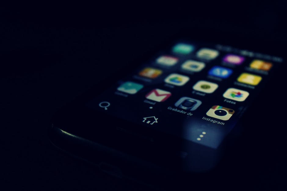
It’s often said that never judge a book, a movie or a packaging by its cover, instead explore it, isn’t that exactly what we all do?
In a world where the number of app downloads is exponentially thriving, you really have to be unique from the other apps to stand the competition. The app icon is a crucial part of the overall user experience and its design should no longer be considered as an afterthought once the actual app has been developed.
The icon design is very important as its the first mode of getting connected with the public. It needs to convey the value offered by the app and therefore, everything should be chosen correctly and with total perfection.
So, to help you out, we have assembled some essential tips that will surely help you to improve the design of your mobile app icon so as to make it shine out amongst the rest.
- Avoid Text
It is an established fact that image icons, delivers much clear ideations as compared to textual icons, therefore you should always focus on zero text. Your app and brand should be discernable by its logo or through the symbol that is showcased on your app icon.
- Keep it Simple
Remember, the size of your app icon is:
- 512 x 512 px for Google Play
- 1024 x 1024 px for Apple Store
So, looking at the above measurements, very tiny and small window is allotted to user for representing the optimized creativity. Using too many elements can become distracting thus, degrading the overall app quality. When the users are going to look for an app in the app store, yours definitely has to be different and better than your competitors so as to grab the attention. So, use that given window wisely and keep your design simple and clear.
However, simple doesn’t imply that you discard everything good from the icon. It is imperative to incorporate details such as reflections, shadow, highlights, color, etc to make a difference. Also, if there is a need to add more than one element in your icon, strive to match them together so as to keep the icon design as clear as possible.
- Mind the Wallpaper
While your app icon may look absolutely stunning when placed against a black background, it may substantially differ with a conventional IOS raindrops illustration. So, it is advisable to always test your icon against different background options to see what appears best across the board. Decipher the requirements of your app and accordingly graph best possible icon image.
- See Who’s Already Out There
In order to ensure success, it is important to invest some of your valuable time and effort into browsing the app store and analogizing your app design to the existing apps. There is nothing more unfortunate than floating your app on the app store and discovering that someone else is using a similar icon design, colors, etc. So, in order to avoid this crisis, always perform an intelligent research.
- Let Your Users Decide
As a matter of fact, surveys do not really work out when it comes to gathering design-oriented feedback. Therefore, it is best to opt for A/B testing technique and find out which option is preferred most by the users. This will help in knowing the actual needs and preferences of your targeted audiences.
- Does The Icon Sync With Your App Design?
The app icon should be in proper sync with the design and must collaborate with the app color scheme. There should be an absolute consistency to proffer a smooth user experience throughout. If you fail to do that, the users will eventually end up uninstalling the app, thus negatively impacting your ASO strategy.
Things to Consider When #DesigningYourappIcon https://t.co/ESqvlDOHnu pic.twitter.com/7o1ZSrCFyX
— OctalInfoSolutionUK (@octaluk) April 19, 2017
- See How the Icon Looks in Accessibility and Dark Mode
Both iOS and Android offer a plethora of viewing preferences so as to customize the user experience. Make sure your icon appears best in all such provided and prescribed mode. Remember to make your app inclusive of all the best design trappings in order to make it more embellished.
- Should You Use Your Logo?
If you have been in the marketplace for quite a while now and have figured out a noteworthy logo related to your brand, then in that case, merging that particular logo into your icon can prove a strong base. But, just ensure that the prevailing logo is well aligned with the app’s core functions.
- Gaming Icons Should Stimulate Action
Gaming apps have a distinct set of rules altogether. While you still seek to remain consistent with the core design and style of the app, triumphant game icons tend to be more complex and they depict a sense of action that impels the user to begin playing the game right away.
- Change with Seasons
It is seen that a multitude of apps has secured success by constantly changing their icons to match the change of season or the upcoming holidays. This helps in keeping the audiences engaged and builds a robust bond with the users.
- Go Crazy
Well, now that you are aware of all the rules, feel absolutely free to break them all. But just make sure to test the results before launching any new icon in the store.
Conclusion
To obtain success and build a unique app that stands out from the crowd, you need to pitch in your deepest thoughts and research into creating an unforgettable and enticing icon. With over 2 million apps to compete with, you need to work hard a little. Do not shirk because the alternative to a fantabulous icon is an unremembered app, drown in the mundane of the app store.


